 “Dream“
Design It Forward – Happy Face
a ScrapArtist Exclusive
Karen asked me if I could do a tutorial on how to achieve this effect, so here is the how-i-did-it:

I started out with these papers, there is something about them, of all the papers in the kit, these with the painty artsy look, I HAD to use them.

I used this photo and as you can see, it is all blurry, but since I didn’t want to chuck it, I love the look on his face and had waited for the opportunity to use it blended on a layout. And now I got my chance. The paintstrokes are perfect for this, you simply mask the photo with it (in the following the words brush, mask and paintstrokes may be used for the same element, please don’t hate me for it LOL).

Let’s get started with a new document (CTRL-N) in the size you want to scrap, I picked the whitish paper as my background, dragged the mask on top of it and and then my photo (see the left side of the screenshot). To clip the photo to the mask, hover between those two layers, hold the ALT-key and click with your left mouse button when the little hand changes to two overlapping circles. Now the photo has taken on the form of your mask. If you don’t like the appearance of it, you can move the photo or mask, turn by using the transform tool Edit>Transform>Rotate or clicking CTRL-T until you like it. For resizing, simply drag the corners. If you hold the SHIFT-key while doing that, the proportions stay intact.

Now I’m gonna change the blending mode of the photo, click the layer you want to blend and go to the box where you have different blending options. I used color dodge, this mode kept the highlights the highlights and the darker colors of my photo took on the colors of the paintstrokes. I also liked the effect of the linear dodge or the screen mode, but the color dodge gave me a bit more contrast. Just play with these blending modes, by dragging the slider of the opacity, you can soften the effect. Instead I strengthened it by duplicating the photo layer in color dodge mode and clipped that to the mask too.
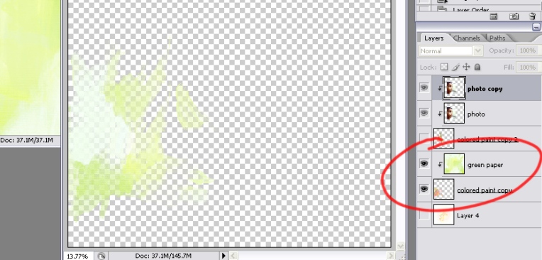
To throw in a splash of green, yeah you know, he is still a boy LOL, I used the green painted paper, duplicated the brush and clipped the paper to it. I turned the brush and placed it a bit to the left. By turning off the other layers (clicking the eyes to the left of the layers) you can now see where and how it is positioned.

Turning on all other layers again, I dragged the other elements I wanted to use and placed them wherever I thought they looked good. Made my title with the alpha and placed some of the flowers behind some letters, got some instant word art. No shadows needed, the alpha came slightly preshadowed. Ha, this tutorial took me longer than making the layout. (for the screenshots I used Danielle Donaldson’s Handy Dandy Day Brushes and Tangie Baxter’s The Director’s Font)
Et voilà, here is the finished page again:
ETA: it is always nice to wake up and find out your page has been placed into the GSO at DST! thanks to Fitria!
